B. At Home
Brand Identity, Art Direction & Applications
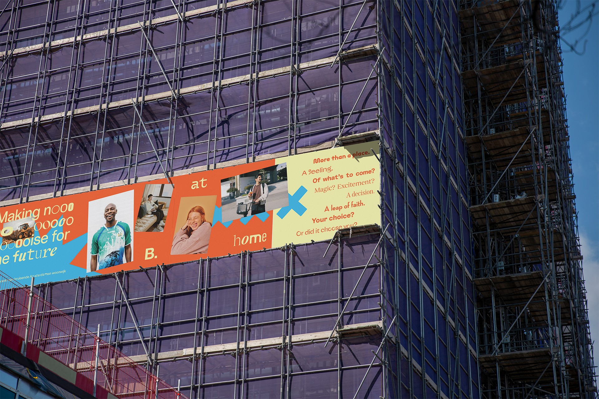
We're bringing living to B. Amsterdam – Europe’s largest startup ecosystem – in Nieuwe Meer Oost, Amsterdam. B. At Home expands the community and rethinks what urban living can be. It is more than just a place to stay – it's a space where likeminded creatives from all kinds of backgrounds connect, collaborate, and feel at home.
Diversity is at the heart of everything B. At Home does – and you’ll see it reflected in the wordmark and typography. Our visual identity uses a mix of fonts to reflect the different voices of B.'s community. No letter is the same, just like no resident is. The graphic system is playful, constructive and a little imperfect – not everything lines up or is rightfully scaled. Because B. At Home is human.
Client: B. Amsterdam, 2025 Together with Ward Cuijper.